
This page presents several technical issues related to static to responsive (smartphone ready) conversion; and of conversion to WordPress for better content management.
Other pages present:
A Short description of the project steps to convert is given here Project Steps
A Guide to getting started to contact us for an estimate is giver here Get Started
A Frequently asked questions section for answers to most questions is here FAQ
A Description of a commercial site converted by Theta Systems is here Case in Point
Modern websites need to be able to respond to screens of different sizes by modifying their layouts. This is known as "Responsive Web Design (RWD)". A CSS framework such as Twitter Bootstrap provides this styling. Good website management demands that page content be managed in a convenient, organized manner. WordPress provides that capability.
To achieve each of these goals for a site that is not yet responsive, or is not a WordPress site, a conversion process is necessary. The following sections present the two individual concepts of this conversion: responsive web design and WordPress content management. These are short descriptions of those two concepts, and each of the conversion processes.
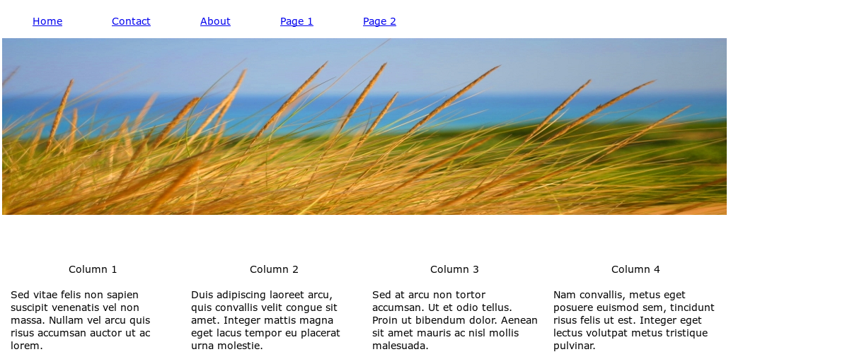
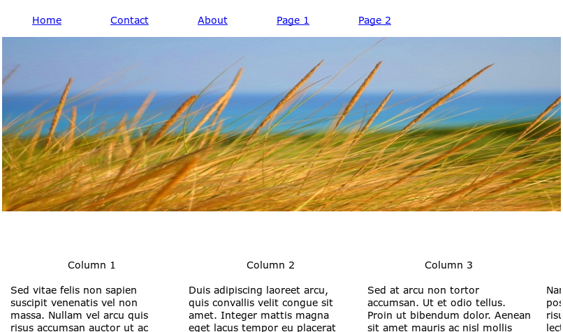
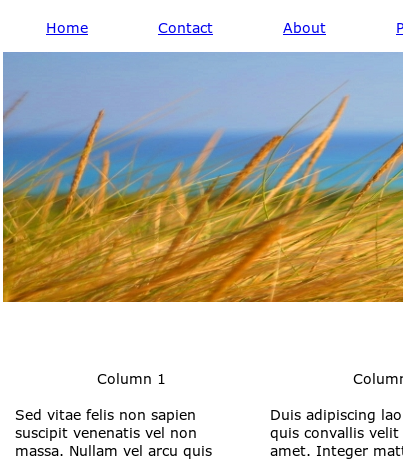
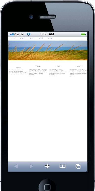
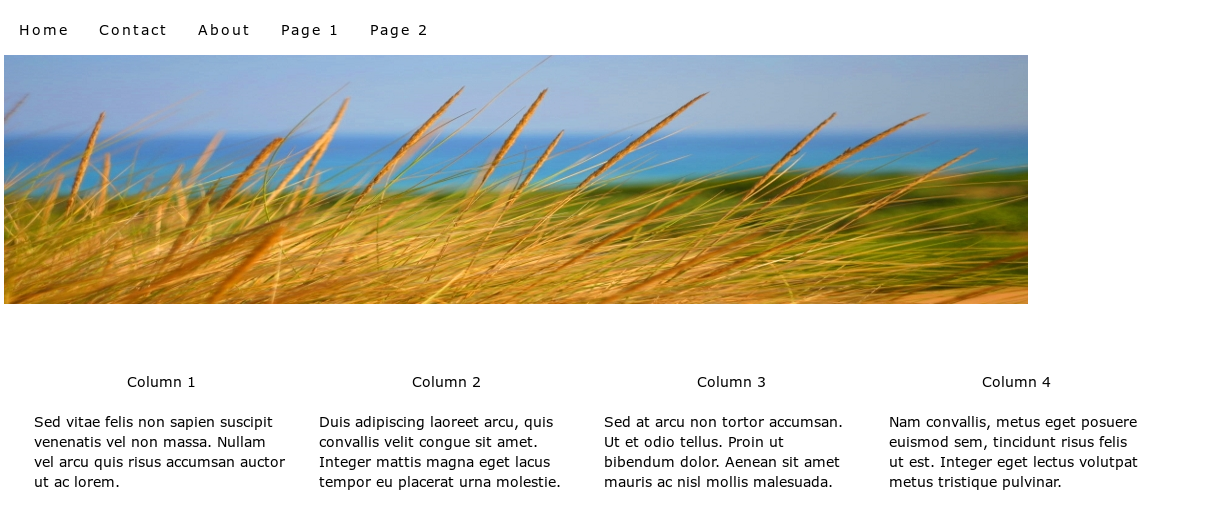
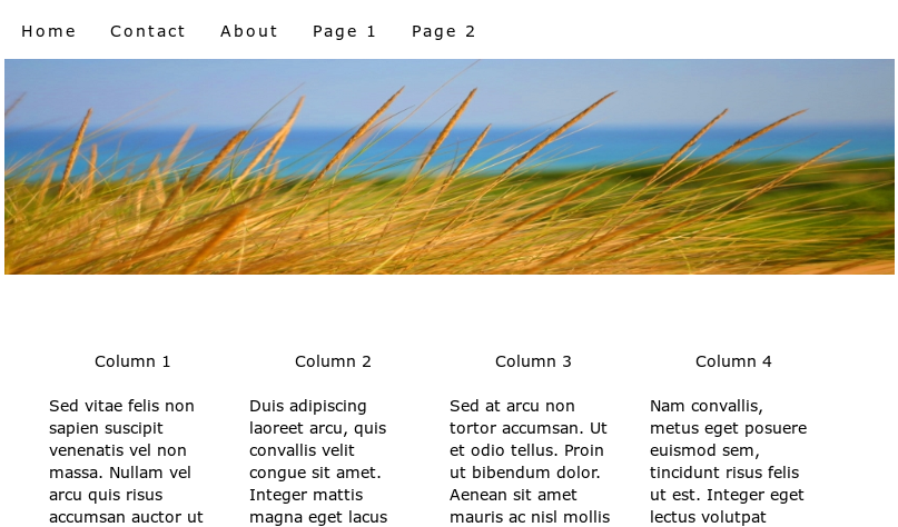
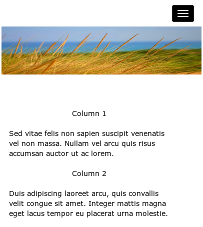
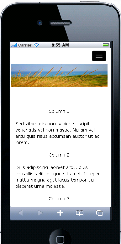
Two simple pages are compared: A static page static_example_page.html
and a responsive page responsive_example_page.html . By viewing these pages in a browser and watching how the page layout changes as the browser width
changes will demonstrate the difference in behavior. The changes are also explained below.
Here's the static page:
To illustrate the conversion process, compare the two code sections below.
The first one is the code for the static page, static_example_page.html. It uses a <table> construct, which allows the placing of elements into a grid of a specific size.
It is this ability to paint the web page with specific sizes and places that makes it a popular style. However, it is just this specification of size and placement that causes the layout to be rigid and inflexible.
The steps are labor intensive. There are no automated tools for doing the work. Each page must be considered as its own separate design challenge.
A simple view of Bootstrap is that it is a CSS file and a JS file, used with HTML constructs, to give HTML code the ability to guide a web page's layout when resizing is required. It also provides a consistent way to create dropdown lists, menus, and many common page components. See: Bootstrap - from Wikipedia To get a copy and read the documentation directly, see: Bootstrap 3
There are three basic questions related to WordPress, and how to get from a non-WordPress site to one
that is managed by WordPress (WP).
In simple terms, WordPress is an open-source web application that provides a convenient way to create, publish, and manage content online. It is widely used in building and maintaining websites. An organized, web accessible program to manage a site's content is called a Content Management System (CMS).
WordPress is free, easy-to-use, feature rich, SEO friendly, and most importantly, WordPress is widely supported. The system itself is supported by a huge group of talented volunteers; and there are hundreds of thousands (if not millions) of developers and web designers working on WordPress plugins and templates.
To read about how WordPress came to be: https://wordpress.org/about/
There are a gazillion websites related to WordPress (a gazillion is a bazillion times 1000). If you really want to spend a lot of quality time reading about all the ins and outs of using WordPress, developing WordPress themes, plugins, and gadgets, go right ahead. It's not hard to develop a website with WordPress by starting with a free or commercial theme, and there are thousands of themes to choose from.
A content management system, or CMS, is a web application designed to make it easy for non-technical users to add, edit and manage a website.
The look-and-feel of the pages is stored in a template, and the subject matter of each page, or "content", is stored is a named place for each different page. The separation of the template from the named page content areas is what makes a CMS such a powerful tool in reducing the effort to maintain a website.
Not only do content management systems such as WordPress help website administrators with maintaining content, they may also take care of a lot of "behind the scenes" work such as:
CTD-WordPress-101.pdf wordpress-101.pdf
Or just Google "WordPress 101" and enjoy.
Good question. The appeal of slick looking and glamorous new templates is very great. It may seem that you could just drop your old content into a new WP theme and have a brand new site. If only it were that easy. There are several reasons to convert, not start over:
A new WP template will be a very new look and feel for your site. It may not work well with your content, and it discards all the value of your current look and feel.
Commercial and free WP templates often have lots of plugins and features builtin which are not ever used or needed. It often takes time to remove unwanted "features", and leaving them there interferes with your management of the theme.
Your existing look and feel can be easily converted to a WP theme, and will keep your current site looking much as it does now to users familiar with it. You will have the advantage of managing your content easily, but keeping all the goodwill value your current site's design has created. Keep the good design, add to the content management.
If you like your current site but just want a better way to manage it, just keep your current look and feel by converting it to a WP template.
First let's look at what a WordPress theme is. It is a small group of PHP programs and a CSS file that create every page of your
site by doing pieces of the page. The following schematic identifies the large sections and the associated PHP programs of a
typical WordPress web page:
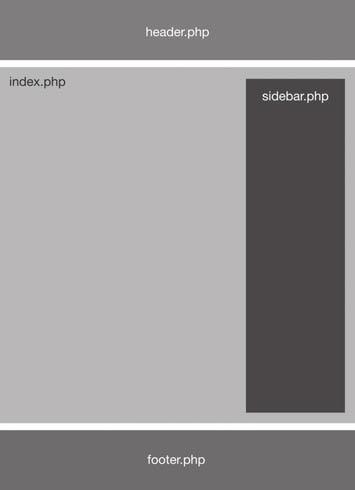
Your current website may not have a footer, or may have a sidebar on the left instead of the right, but it does have an overall look which can be extracted as a template. Once we identify the sections of your page's layout, we take the HTML for each section, and program the appropriate PHP function to create that HTML.
We create a page.php, which is the primary driver program for each page's creation, programming it to insert your content into the proper place for presentation by the browser.
Rather than giving a detailed view of the conversion process, you can get a good feel for it using the schematic and description above. In short the process is:
The steps are labor intensive. There are no automated tools for doing the work. Each page must be considered as its own separate design challenge.
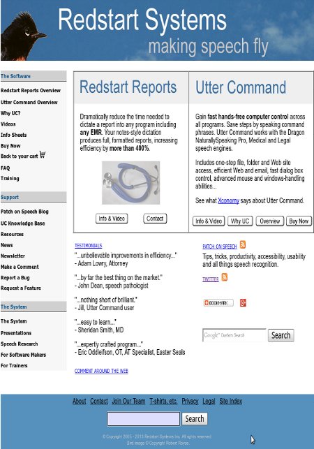
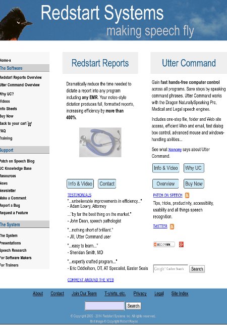
Redstart Systems Inc., a recognized leader in speech access technology, recently decided to convert its existing site to using responsive pages for easy smartphone viewing, and to convert the static HTML to WordPress, keeping the exact content and look-and-feel of the original site. Redstart Systems makes Utter Command, intuitive speech interface software that makes hands-free computer control practical – and faster than the keyboard and mouse.
The process of conversion took place in two steps: convert to RWD using bootstrap 3, and then convert this new code to WordPress.
Inspection of the index page for the original site (an archived copy of the original site) shows that there were several challenges to be overcome. The before and after index pages are also shown below.
Step 1. Conversion to responsive code.
Following the steps presented in the section on conversion to responsive code (see Responsive Conversion Steps above), each section of the original page needed to be recast into a fluid grid. Outlines were removed, borders were softened, and each section was checked for its appearance in several screen sizes.
Step 2. Conversion to WordPress code.
The steps involved were to break up the Dreamweaver pages into sidebar, header, and footer, then extract the contents of all site pages (see WordPress Conversion Steps above).
The preservation of the original look and feel seen in the "before" and "after" images below illustrates the "Convert. Don't start over from scratch." approach we take.
Note that the final page looks almost exactly like the original page. It has not been redesigned or modified to make it responsive, or to convert it to a WordPress template. It preserves the original look and feel exactly.
To get the full effect for the RWD conversion, look at the current site (here )in a smartphone to see how much more readable it is than it would have been in its static form.
The truest sense of accomplishment comes from a satisfied client.
"Alan did a great job of converting our site to WordPress, kept us in the loop during the conversion with clear communications and explanations, and left us with clear written instructions that
will allow us to easily maintain the site. I very highly recommend Alan and Theta Systems to anyone considering converting a site or creating a new one."
- Kim Patch, president and founder of Redstart Systems.
~~~ Theta Systems Inc ~~~